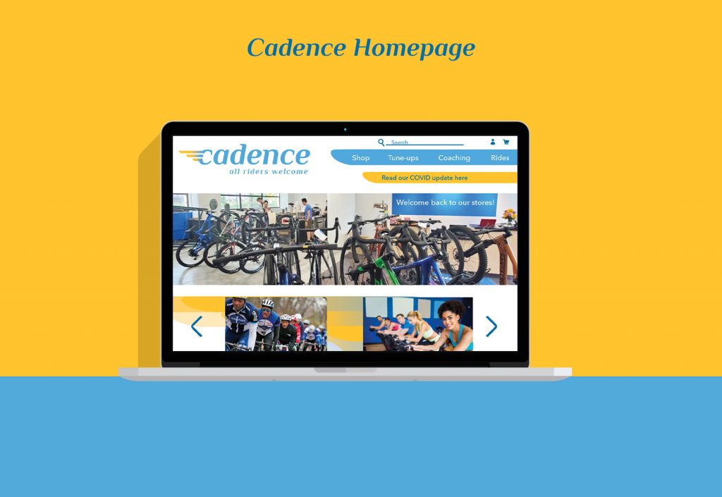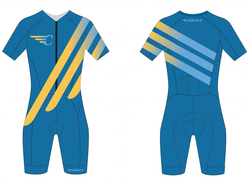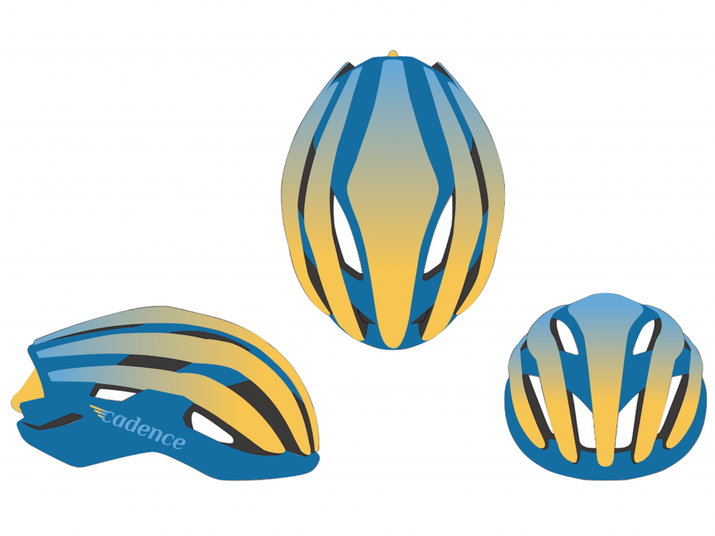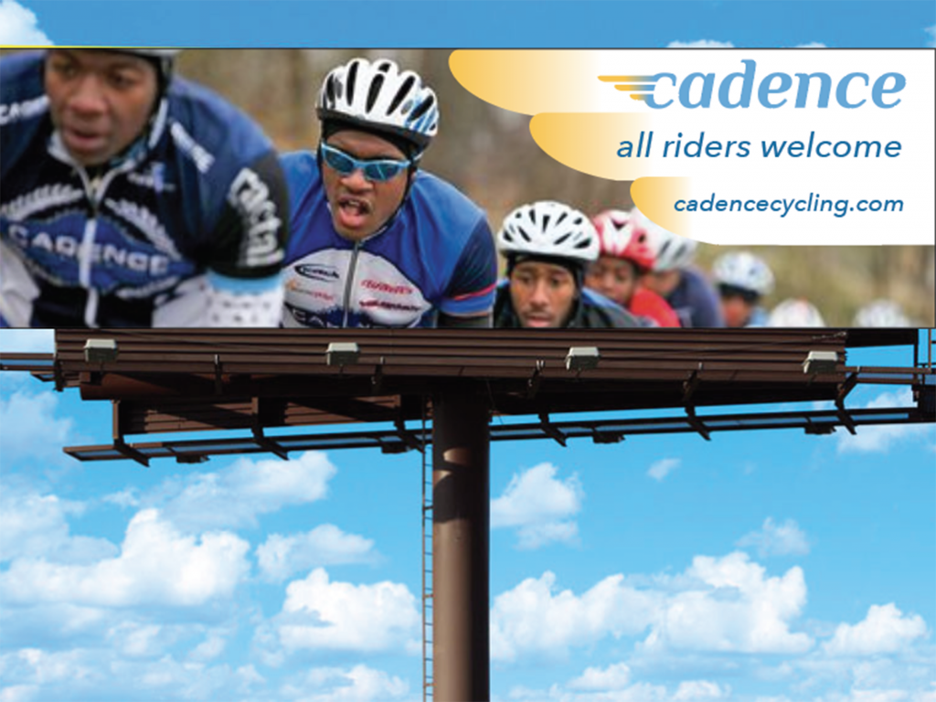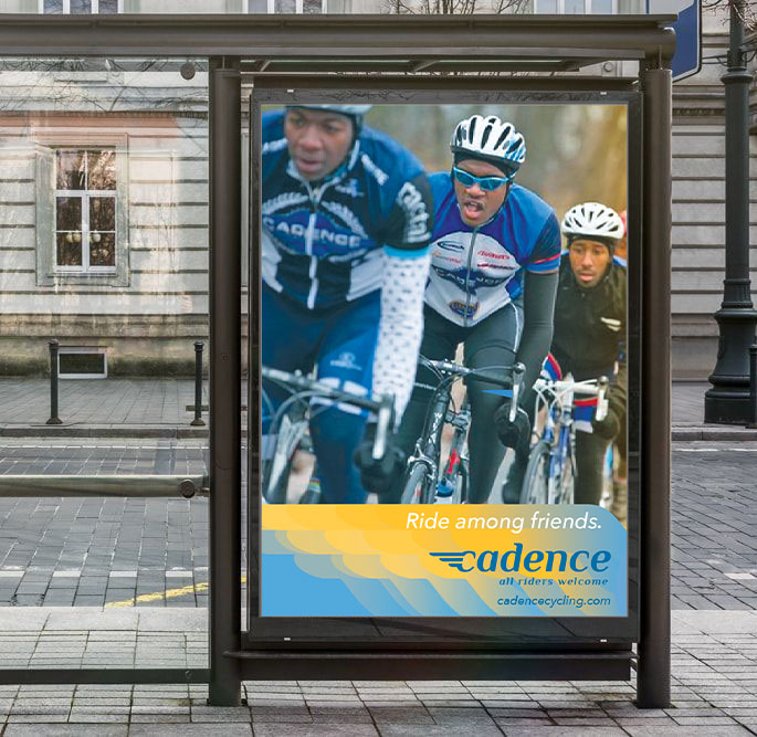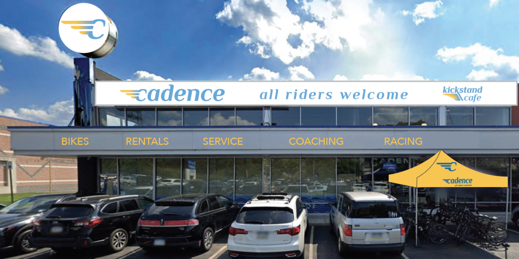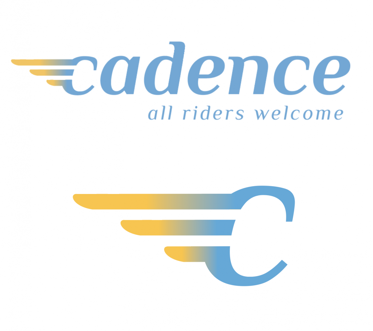
This is a rebranding for Cadence Cycling Centers, a bicycle retailer and tuning workshop with locations in Manayunk and Philadelphia. The logo redesign employs a lighter, sleeker wordmark and lettermark “c” with wings inspired by the Art Deco style. I used lighter blues in keeping with the original logo, but added gold for a pop of energy. These branding elements were used for mockups of website and poster designs, social media posts, billboards, a bike racing suit, merchandise, and an event tent. I am particularly proud of presenting the winged Cadence lettermark replacing the large fading Coca-Cola sign at the Manayunk location, which was formerly the Manayunk Diner.